Aesthetics and Branding: Utilizing Color Theory to Design Engaging Pet Products and Packaging

Walk down the dry-kibble aisle of any large-format US grocery store and the colour story — what designers call color psychology in branding, applied to pets — tells you what the brand believes about its buyer before you read a single ingredient. Chewy's deep blue and white sits at the front of the e-commerce aisle the way a bank sign sits on Main Street. BARK throws mustard yellow and pastel pink at you the way a toy store would. Stella & Chewy's red anchors the freezer case. Blue Buffalo's signature blue and diamond mark show up on every premium-tier endcap. Kindfull, Target's house pet line, uses 90% neutral pastels and paper-cutout illustrations to translate a premium-tier palette down to a value-tier price point. None of this is accidental, none of it is invisible to the buyer, and almost none of it works the way the color-psychology infographics on Pinterest say it should.
This piece is a deconstruction of color psychology in branding as it actually shows up on the pet shelf — receipts, named brands, regulatory constraints, production-cost math, and the moment in 2025 when matte chalky pastels quietly replaced saturated CMYK as the premium signal. It is written for designers, brand strategists, and the pet-brand founders who keep being handed twelve-colour infographics by their agency partners and asked to "evoke trust with blue."
A useful first stat. Pet Food Processing reports that 30% of pet owners whose pet is under a year old rate packaging graphics and colour "extremely or very important" — versus 19% of longer-tenured owners. First-time-shopper conversion runs on the pack. Repeat-purchase loyalty runs on the brand and the ingredient panel. Anything you read about colour-as-conversion is implicitly about the first eighteen months of pet ownership.
What "color psychology in branding" actually does on a pet shelf
Most of the color psychology in branding content circulating on the design internet is a twelve-colour wheel with one association per colour ("blue = trust, red = passion, yellow = optimism, green = growth"). It is also nearly two decades out of date as a guide to what the premium pet shelf is actually doing.
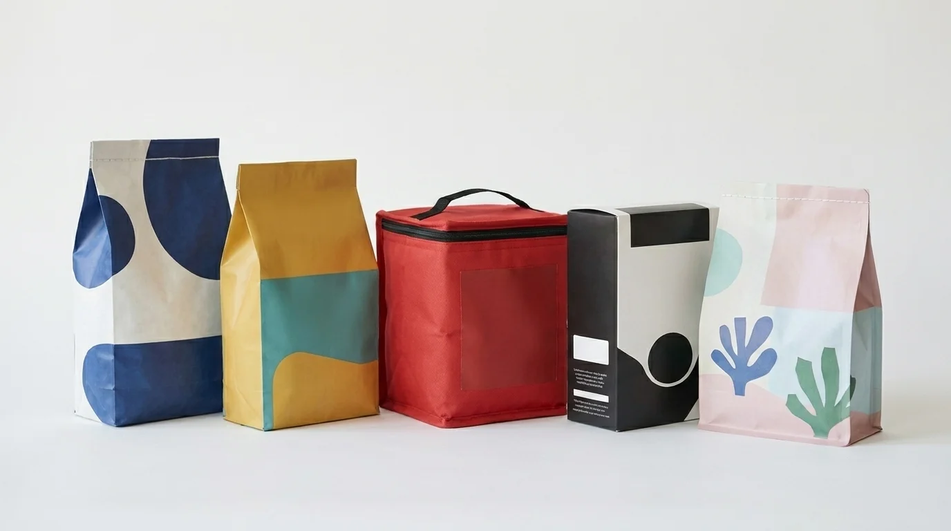
The 2025 premium signal in pet packaging is, at the surface level, the opposite of saturated. MTPak's design-intelligence brief on premium pet snack packaging is explicit: matte and soft-touch finishes have replaced gloss as the premium cue. The premium-tier colour palette has desaturated — chalky pastels, muted earth tones, and high-contrast monochrome read "premium" in 2025; saturated CMYK with gloss reads "value tier". The Maev raw-feeding line in plain black and white is the clearest end of this spectrum; the Kindfull pastel-paper-cutout aesthetic on a Target shelf is the other end, executing a premium look on a value-tier SKU.
This matters because the older advice — "use warm reds and oranges to grab attention, use cool blues and greens for calm wellness products" — produces packaging that now reads as the cheaper SKU on the shelf, not the more premium one. The infographic isn't wrong about which colours generate which broad emotional associations. It is wrong about what the contemporary premium-pet-shopper has trained themselves to read as "expensive." That training is happening through finish, not hue: a matte chalky pastel says "premium" because the matte finish does the heavy lifting; the pastel is the second voice.
The honest version of the advice: choose a palette that earns its job in the specific tier and category you are competing in, not the one an older infographic generalised across all categories.
Real brands, real palettes (no "Paws & Whiskers")
If colour theory matters anywhere in pet branding, it matters on the named brands the industry actually sells. Here is what some of them are doing, with their palette choices read against their positioning.
- Chewy — deep blue (#0a3c8f) and white. The palette is overtly corporate, deliberately the colour of retail authority, and reads as the "default" pet-purchase destination the way Amazon's navy reads as the "default" everything-purchase destination. Chewy is not trying to be exciting; it is trying to be the answer to "where do I buy this." The blue is doing exactly that work.
- BARK / BarkBox — mustard yellow, teal, deep blue, pastel pink. This is the palette equivalent of a toy aisle, intentionally refusing the wellness/clinical convention most pet brands default to. BARK reads as fun, joyful, and uninterested in mimicking human-grocery seriousness; the palette is the whole brand argument.
- Blue Buffalo — signature blue plus the diamond mark. The blue here is not Chewy's retail-authority blue; it is shelf-recognition blue. The diamond is the actual semantic anchor. The brand uses the colour for findability and the mark for premium-tier positioning; together they outrank the broader "blue Buffalo wilderness" palette assumption most people remember.
- Stella & Chewy's "Wild Red" — red as proprietary brand asset, paired with raw-feeding wilderness positioning. The brand has worked to make a specific red ownable in a category where most premium players default to navy, hunter green, or muted earth tones. The differentiator is the colour itself.
- Lyka — green plus light orange contrast, on a biodegradable zip-lock subscription pouch. The green carries the fresh/whole-food argument; the orange contrast keeps the pack from reading as either clinical or hippie. The zip-lock is the structural co-argument the colour is reinforcing.
- Maev — black and white minimal, premium raw positioning. The palette is doing the work the typography would have to do if the palette were busier. This is a $/serving line whose pack design relies on negative space to telegraph confidence.
- Kindfull (Target house brand) — roughly 90% neutral pastel + hand-drawn paper-cutout illustration. The Kindfull design exists to lift an affordable line into the premium-cue palette without paying the premium-tier per-unit print cost. It is the most studied "value SKU using premium-tier design language" example in the category.
What you do not see, on any of these brands, is the twelve-colour wheel applied wholesale. Each palette is doing a specific job in a specific tier against a specific competitive set. The brand color psychology principle being applied is consistency and ownership, not "blue means trust."
What AAFCO, the FDA, and the EU actually let you do with colour
The colour palette discussion ends, or at least pauses, the moment you look at the back panel.
In the United States, the colour real estate on a pet-food back panel is now constrained by the Association of American Feed Control Officials' Model Pet Food and Specialty Pet Food Regulations, published in 2024 with state-by-state adoption underway through 2025 and beyond. The model regulations now require a mandatory Pet Nutrition Facts panel — visually modeled on the FDA human Nutrition Facts box — that must be "all black or one-color type, printed on a white or other neutral contrasting background so as to be clearly visible." Translation for designers: there is now a fixed monochrome rectangle on the back panel that your brand palette has to work around, not over. As states adopt the model rule, designers are losing roughly a third of back-panel real estate to a high-contrast legibility-mandated block.
The food itself, separately, cannot be tinted to support a colour story on the front of the pack. The FDA's color additive rules, restated through AAFCO labeling guidance, prohibit the use of colour additives in pet food unless that specific additive is approved for that use in the Code of Federal Regulations administered by the FDA. That is why the "bright orange real-food kibble" cue you sometimes see in pet-food advertising belongs almost entirely on the packaging — not in the bag. The kibble looks the way the ingredients let it look.
A regulatory bookkeeping note worth tracking for the next few years: the FDA–AAFCO Memorandum of Understanding expired October 1, 2024, which means the FDA, not AAFCO, now owns pre-market pet food ingredient approval. It does not change colour rules directly, but it flips which agency designers and regulatory-affairs teams should be watching for the next round of labeling guidance.
On the European side, the design constraints are bigger and the deadlines closer. Regulation (EU) 2025/40 — the Packaging and Packaging Waste Regulation — entered into force February 11, 2025, with general application from August 12, 2026. Pet food is classified as "contact-sensitive packaging" and falls inside its scope. Three concrete consequences for pet packaging design:
- Post-consumer recycled content mandates. Contact-sensitive PET packaging must contain at least 30% recycled content by 2030 and 50% by 2040; non-PET plastic contact-sensitive packaging must contain at least 10% by 2030 and 25% by 2040. The colour and finish characteristics of PCR-content substrates differ materially from virgin material.
- PFAS prohibition. PFAS at concentrations ≥25 ppb are prohibited from August 12, 2026. This affects barrier coatings on the inside of pet-food pouches and is forcing a shift in substrate and ink technology that, downstream, affects colour reproduction quality.
- The end of "perception of volume" formats. The regulation explicitly bans "double walls, false bottoms, and unnecessary layers that increase the perception of volume." Inflated premium pouches and oversized boxes engineered to telegraph generosity have a hard end date in the EU. Premium-tier pet brands that have relied on package size as the volume signal have to do that work some other way.
None of this is in the top-ranking color psychology in branding articles on Google, because none of them write for the designer who actually has to ship a compliant pack. This is the gap the article you are reading is filling.
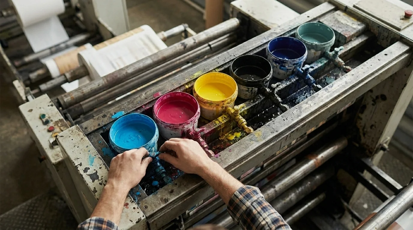
The math of the print run
The other reason the twelve-colour wheel is the wrong tool for pet packaging is that most pet packaging is printed on flexible-film presses with a fixed number of ink stations. The economics constrain the palette before the brand argument does.
Most flexible-packaging presses in the category are 6-station: four stations for CMYK and roughly two for spot/Pantone colours. Each Pantone plate on an offset run costs roughly $85 to $120; metallic Pantones add approximately 40% to the per-unit ink cost; fluorescents add approximately 65%. The implication: a premium pet brand that wants to use a precise brand-Pantone, plus CMYK for photography, has roughly one slot left for a metallic accent or a second spot colour before the unit economics start dictating "less is more."
This is the unstated reason so many premium pet packs converge on two-to-three-colour systems. It is partly aesthetic conviction. It is at least equally a print-run-cost ceiling. When you see a $/serving line in a clean two-colour palette with a deboss for the brand mark, you are looking at a deliberate aesthetic choice and an honest production-cost decision at the same time. Both are valid. Both should inform the design brief.
The corollary: a 12-station press is overkill for most pet SKUs, the cost per unit is meaningfully different, and any agency presenting a "you need eight spot colours to express the brand" deck without showing the per-unit print-cost impact is presenting half the picture.
Sustainability is now a colour decision
The sustainability conversation in pet packaging has crossed the threshold from talking point to purchase signal. Industry trade press cites roughly 70% of US pet owners as preferring brands that demonstrate a sustainability commitment. The colour and finish consequences of that signal are visible on the shelf.
Kraft and brown post-consumer recycled fibre substrates have moved from indie-only to mainstream. Water-based inks reproduce colour differently than the conventional solvent-based inks they are replacing, with subtle changes in saturation and finish that brands building palette systems in 2026 need to test against. Reduced-coverage graphics — more negative space, fewer flooded backgrounds — both reduce ink consumption and produce the cleaner look that the matte/premium signal already rewards. The two trends compound: the sustainability colour shift is also the premium-signal colour shift.
This is the single highest-leverage place a pet brand currently chooses its colour palette: not "what evokes the right emotion" but "what reads as both premium and sustainable to the buyer who is increasingly indexing on both at the same time."
Cultural colour beyond the "white = mourning" cliché
The cultural-colour section in most articles about color psychology in branding ends with the "white symbolises purity in the West, mourning in the East" line and moves on. That is, at this point, the part of the cultural conversation least useful to a pet brand actually exporting product.
China is the most important case study. China's pet care market reached 300.2 billion yuan in 2024, up 7.5% year over year, with projections to 811 billion yuan in 2025. Luxury entrants — Prada, Tiffany, and Louis Vuitton pet lines among them — have crossed into the segment. The festive-luxury colour cue remains red and gold, particularly around the lunar new year. But the urban-premium pet palette has shifted materially toward Nordic-style muted neutrals as urban buyers index on wellness rather than ostentation. A pet brand exporting to a tier-one Chinese city in 2026 with a saturated festival palette is reading older than its target shopper. A pet brand exporting with a Nordic-neutral palette plus a festive-edition red-and-gold variant for the Chinese New Year window is reading correctly to both registers simultaneously.
The wider point: cultural colour symbolism for pet products is no longer a one-paragraph caveat in a branding article. It is a multi-region palette-system decision with real per-market revenue implications.
The shorthand for designers
Three things, if you only take three things from this article.
First: the twelve-colour wheel is the wrong tool. Choose your palette by reading the tier, category, and competitive set you are entering, not by matching hues to broad emotional associations. The premium signal in 2025 is matte, muted, and high-contrast; the saturated CMYK with gloss palette has moved down a tier.
Second: read the fine print. AAFCO's monochrome Pet Nutrition Facts block is taking real back-panel real estate in the US. The FDA prohibits colour additives in the food itself. The EU PPWR is reshaping substrate, finish, and package format on a hard August 2026 deadline. Any colour strategy that does not flow through these constraints is a colour strategy you cannot actually ship.
Third: account for the press. The 6-station flexible-packaging reality and the $85-to-$120-per-Pantone-plate cost structure are the practical reason most premium pet brands converge on two-to-three-colour systems. The math of the print run is also part of the brand argument.
The bag on the shelf is the result of all three decisions running at once. Read the shelf the way Nisha reads a label: a press release in colour is still a press release. The regulation, the production economics, and the named brand teardown are where the actual story lives.
Frequently Asked Questions
In 2025, premium pet packaging has converged on muted earth tones, chalky pastels, or high-contrast monochrome (Maev, Kindfull) with matte or soft-touch finishes. Saturated CMYK with gloss now reads value-tier rather than premium. Named exceptions: Chewy (deep blue + white = retail authority), BARK (mustard + teal + pastel pink = toy-aisle disruption), Stella & Chewy's (proprietary red).
AAFCO's model Pet Food and Specialty Pet Food Regulations require a mandatory Pet Nutrition Facts panel that must be all-black or one-color type on a white or neutral contrasting background. The food itself cannot contain color additives that are not approved in the FDA's Code of Federal Regulations — so the colour story belongs on the pack, not in the kibble.
Yes. From August 12, 2026, the EU Packaging and Packaging Waste Regulation (Reg 2025/40) bans 'double walls, false bottoms, and unnecessary layers that increase the perception of volume,' requires PFAS below 25 ppb, and phases in 10 to 30% post-consumer recycled content for contact-sensitive plastics by 2030. Inflated premium-pouch formats are on borrowed time in the EU.
Production economics. Most flexible-packaging presses are 6-station — 4 stations for CMYK plus only around 2 for spot/Pantone — and each Pantone plate runs roughly $85 to $120, plus metallic (+40%) or fluorescent (+65%) per-unit ink premiums. The visual 'less-is-more' minimalism is partly aesthetic conviction and partly a print-run cost ceiling.
Yes. China's pet care market crossed 300 billion yuan in 2024 with luxury entrants (Prada, Tiffany, Louis Vuitton pet lines). Red plus gold remain the festive-luxury cue, particularly around the lunar new year, but the urban-premium palette has shifted toward Nordic-style muted neutrals as buyers index on wellness over ostentation. Multi-region brands often run a neutral base palette with a festive variant for the Chinese New Year window.
For newer pet owners, yes — 30% of consumers who have had their pet under a year rate package graphics and colour 'extremely or very important,' versus 19% for longer-tenured owners (Pet Food Processing). Established owners shift their decision weight to brand and ingredient panel. Visual-first packaging matters most for first-time-shopper conversion.